.png)
Table of contents
Picture this: your last QBR, your team agreed on the target accounts, the ICP, the outreach approach. Marketing ran the campaigns. Accounts warmed up. And then — somewhere between that meeting and today — the motion broke down. Sales was working a different list. The hot accounts marketing surfaced went untouched for weeks. Nobody noticed, because nobody had a shared place to look.
For GTM alignment to hold in practice, both teams need shared visibility into what touches were made, by whom, how many times, and whether they moved accounts toward pipeline and revenue. Without that, even the best planning sessions produce commitments that quietly erode in execution.
The GTM Leader Dashboard is the operational foundation that changes this. It’s a new report available now in N.Rich.
What is the GTM Leader Dashboard?
The GTM Leader Dashboard is a foundational operational layer for GTM teams running account-based programs. It gives sales and marketing leaders a live, shared view of what each team is doing — which accounts have been touched, how many times, through which channels, and how effectively those touches are translating into pipeline and revenue. Every metric is filterable by ICP and non-ICP, and every account is one click away from the CRM record.
The dashboard is organized into four tabs, each answering a question that used to require a CRM export or a meeting to get to.
Hot Accounts: Are we capturing the signal?
The first tab is the one you’ll probably check most often. It shows you the accounts that have reached the hot stage — meaning marketing has done its job and these accounts are ready to be engaged by sales. Then it shows you what happened next.
You can see what proportion of hot accounts sales has touched versus left untouched, the revenue potential sitting in both groups, and how quickly your team is responding after an account turns hot. The comparison between sales touch to SQL conversion on hot accounts versus cold ones is also visible here — so you can have an honest conversation about the value of acting on warm signals rather than cold-calling a random list.
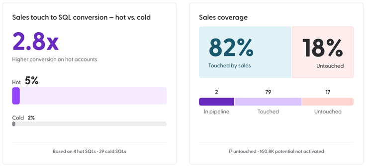
Alignment: What actually happened to those accounts?
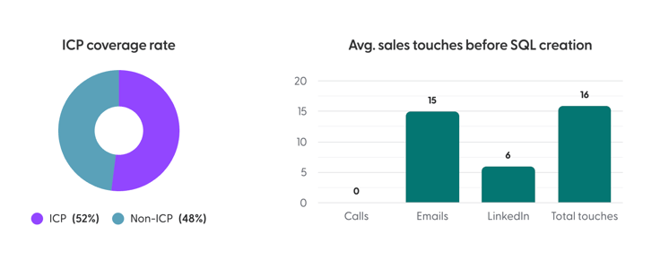
This is the tab marketers have always wanted. For every account in your program, you can see whether sales touched it — and if not, exactly how long it has been sitting untouched. One week. Three weeks. That level of specificity turns a vague concern into a very specific conversation.
You can also filter by ICP and non-ICP across the entire dashboard, which lets you quickly check whether the accounts sales is spending time on are the same ones marketing has been investing in — or whether there’s a gap.
Sales Performance: What are reps actually doing?
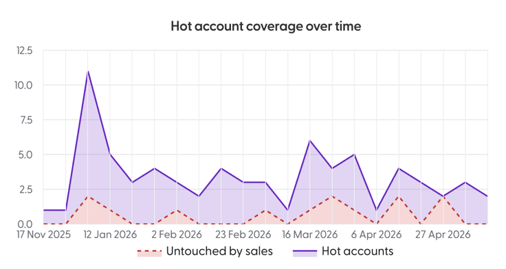
For marketing leaders, this tab offers a level of transparency that is usually out of reach. For sales leaders, it’s an easy way to spot who might need coaching and on what.
You can see each rep’s ICP coverage rate — what proportion of their touches are landing on ICP accounts versus non-ICP — along with the channels they’re using and how their activity compares to team averages. Click into any rep and you see the full picture: which accounts they’re working, what stage those accounts are at, and exactly when they last made contact.
CRM Data Coverage: Can we trust the data?
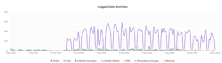
Everything in the GTM Leader Dashboard depends on sales activity being consistently logged. The CRM Data Coverage tab shows whether it is — with a daily trend of logged activity across every channel: emails, calls, LinkedIn messages, LinkedIn InMails, SMS, WhatsApp, and meetings.
If there are gaps in logging, you’ll see them here. That makes it much easier to address CRM hygiene before it distorts the rest of your data — or the conclusions you draw from it.
Who is it for?
The GTM Leader Dashboard is useful for anyone who leads or influences a revenue team. Marketing leaders get the visibility they’ve been missing into what happens after the handoff. Sales leaders get a clear view of where their team is spending time and whether it’s directed at the right accounts. Everyone get the shared operational view they need to run an honest pipeline review. The GTM Leader Dashboard puts the same information in front of both teams — and makes the conversation about what to do next a lot easier to have.
Available now
The GTM Leader Dashboard is live and available to N.Rich customers today. Interested to see how it can work for you? Reach out to your account team or book a demo.

Table of contents