Ready to become an N.Rich AI builder and get paid for it?
On-demand
Product Webinar: introducing GTM OS by N.Rich
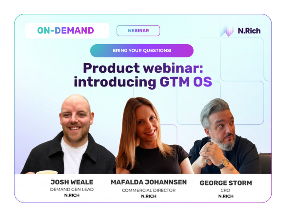
In this webinar, Yulia Olennikova from N.Rich was joined by three power users of N.Rich —Josh Weale (Head of Demand Generation), Mafalda Johannsen (Commercial Director and Head of BDR), and George (CRO) — to introduce GTM OS and demonstrate how it creates a unified source of truth across marketing, sales development, and C-suite operations.
They covered practical use cases including budget pacing dashboards, pipeline influence tracking, hidden gems identification, and BDR prioritisation. Watch the full recording to see how GTM OS breaks down data silos and enables better collaboration across revenue teams.
Transcript:
Speakers:
Yulia Olennikovannikova — Marketer at N.Rich
Josh Weale — Head of Demand Generation at N.Rich
Markus Ståhlberg — CRO at N.Rich
Mafalda Johannsen — Commercial Director and Head of BDR Team at N.Rich
Hello everyone, and thank you for joining, whether you are watching live or in recording. I am Yulia, Marketer at N.Rich, and I'm joined today by three colleagues who are power users of N.Rich and GTM OS in particular. We'll hear from Josh, our Head of Demand Generation, on his use case of using GTM OS and N.Rich data for marketing and demand generation. Then Mafalda, our Commercial Director and Head of our BDR team, will discuss how she's using GTM OS for BDR needs. Finally, George, our CRO, will share high-level C-suite use cases and how he's using N.Rich to see everything happening from a revenue standpoint in the organization.
Before we jump in, I want to share the prerequisite of why GTM OS was built and how it changed the way we work. In every revenue organization, the three departments you see on screen—marketing, sales development, and C-suite—typically don't communicate well. The main format of communication is asking about data, questioning data, and challenging data: "Where did you get this data? I have a different one that says exactly the opposite." This doesn't help productive communication among revenue teams.
Over the last four weeks, something shifted. Whenever someone asks a similar question, the other person responds with a GTM OS link. We're not asking fewer questions, but we've removed so much unnecessary frustration and friction because we know we're operating with the same set of data, the same source of truth, looking at the same data in N.Rich, in the CRM, and in the ad platforms that feed into N.Rich.
GTM OS isn't a new feature—it's a new way of working with existing features and existing data. With that, I'm handing over to Josh to walk through a marketing use case and a dashboard he built.
Thank you, Yulia. For those who don't know, I head up Demand Generation at N.Rich, which means I'm an end-to-end user of N.Rich to market N.Rich. I work in the platform every day on campaign execution and also on how campaign performance feeds back into the business and how our team—me, George, Mafalda, and the rest of the revenue organization—makes decisions about advertising, accounts we focus on, and where we prioritize effort.
I have four examples rolled into one journey of how I think about GTM OS. The issue I've traditionally had with ad platforms is that data sits in silos. You have to look at different spreadsheets and tabs to understand what's happening across scenarios. As a demand gen marketer, some of the most important things are understanding budget pacing in terms of delivery and performance, and what that translates into in terms of ad engagement.
The first thing I built was a budget pacing chart that allows me to see across all my active campaigns how they're pacing against the budget we're deploying. Is it evenly distributed? Do we have campaigns underpacing? We do have one here at 38% pacing, which tells me the segmentation needs to be looked at. From a day-to-day perspective, I want to see that the budget we're deploying is being spent on the right accounts based on our segmentation. This is a daily health check I review every single day because if there's a major issue, I need to know. Most are close to 95 to 100%, though some are slightly down because they're new campaigns still ramping up.
I also want to understand how the ads we're deploying within N.Rich are performing. We operate with cross-channel display ads, native video ads, and native article ads, which is our proprietary delivery mechanism. Within this view, I see all my different campaigns and at a glance how each ad is performing relative to what I'd expect. I set thresholds based on what has historically been relevant for N.Rich as a brand. This isn't universal—it's relative to the audience you're targeting and who you're focused on. This is a one-stop shop where I can see in a single view how all my different campaigns are performing and whether there are any ads not performing well.
Traditionally, what I would have done is export all the data, put it into Excel, build pivot tables—things I'm not expert in. With GTM OS, it's as simple as asking how N.Rich has influenced pipeline over the last 12 months. I get an integrated view of all influence pipeline month by month, including where that pipeline is in terms of stage and what engagement types are influencing that pipeline and in which campaigns. I can cross-reference my ad view with the pipeline view to see where effort is actually going in terms of influencing pipeline. This is a simple way of creating a customized environment I can share with George and the rest of the team as our source of truth for how N.Rich is influencing pipeline.
The last thing is about prioritizing effort. In any ABM motion, we want sales and marketing working closely together focused on the right accounts. I'm fortunate we have that dialogue every day, but one interesting use case for N.Rich is finding opportunities within our segments where there's outsized engagement for specific accounts. I've built a hidden gems dashboard where I can filter between different company sizes and see how different accounts are engaging against the benchmark average for that size. I can push this data to sales to say we have opportunities here—this company with only 140 employees is punching above its weight, engaging above the average baseline with a composite score of 91 in intent, making them a good opportunity for outreach. This is where Mafalda's team comes in to build sequences.
End to end, rather than taking everything in spreadsheets and sharing version 1, version 5, version 100 final, I have one view I can iterate on as new things come up or we want to add features. It's relatively easy to pull this together in GTM OS. If you have questions about how this was built or how you might tweak it for your needs, please use the chat or questions box.
I see Ylva typing a question about ready-to-go templates. We are working on a library of templates and prompts, categorized by use case and persona. This is still in progress.
The idea is that since Josh is a day-to-day user, he's probably the closest to any of our customers in terms of being an active N.Rich customer himself. Anything he builds here will ultimately become a template or app we can share externally.
We have a question from Nicholas with a lot of abbreviations: Is there any plan to have API endpoints, not MCP, just regular vanilla code API? That's something we need to ask our dev team to give a definite answer on. We are working on the MCP right now. Josh, do you happen to know if someone is using the API directly right now?
No, as far as I'm aware, the focus is on building out an MCP server. But obviously within that, there are elements of that because we do do customization work as well. It's probably a question we can take offline and speak to the dev team about.
This is a good moment to transition further down the process. When we have all of those signals, all of those hot accounts, all of those accounts needing immediate attention, they go directly to Mafalda and her team. This is what she's doing after that.
Thank you, Yulia, for inviting me to speak. I'm super happy to discuss this topic because as Head of Business Development, I've been in many companies and we always had the same issue Yulia mentioned—we don't have that here. I have a great relationship with Josh, and the business development team is part of the marketing department, hence my hybrid title. But I've struggled in my career with the fact that marketing creates campaigns, puts in budget and effort warming up accounts and making companies know our name, and then that data is scattered everywhere. It's very hard to see in one place which companies are engaging, how, and what we should do. This is one of many things GTM OS can help business development departments.
For me, it's really important that my team prioritizes hot and engaged accounts, right? But not just which companies, but also how. This is exactly how this GTM OS app I built can help. Here we have two companies that are actually customers, which we can see in the dashboard. These would be customer success accounts, so my team doesn't act on warm accounts that are already customers. We focus on prospects, potential customers. Here we know that one has high priority. We know how many visits, what's the trend, and what to do. You have that per week, and then the entire team knows exactly what to do at all times. The best part is I have visibility in a couple of seconds. Whenever I need, I can tell the BDR assigned to a certain account: "Hey, these are engaging, don't forget to go after." This gives me visibility to ensure they're acting on the right accounts, which I didn't have in previous companies.
Here's the beautiful part: Josh is very tech savvy—I'm always impressed by that, but I'm not. To build all of this, the only thing I did was write this prompt. That's the beauty of GTM OS. Not only do I have visibility on what moves the needle for my department, but I have it without bothering RevOps, without bothering Josh, and without spending loads of hours building a dashboard myself or trying to find visibility. I just need to prompt. Everyone knows how to prompt nowadays. If I don't get it right the first time, I can continue prompting, like in an LLM. If GTM OS doesn't show me what I need immediately, I can say, "Hey, this is lacking" or "This is not what I mean exactly," and I can add as I go. Then the app is ready and I can refresh it every week.
I've built another one for my team's activities that I can just refresh every week. It's very easy to have visibility with basic prompting without bothering other departments. Some questions I need to communicate about very often—with the marketing team, with my CRO, with my team. Instead of digging into data to find answers, I can just prompt and have results in a couple of seconds. That really takes a lot of time away so I can focus on other work and have better answers to super important questions for the next quarter or semester.
In general, what you have in GTM OS versus the prompt—the level of prompt and how detailed it is—the result you get is disproportionately better looking. You look at the dashboard and you'd think there's probably a huge engineered prompt behind it. Then you open the prompt and it literally says, "Show me the hot accounts." And it's showing you the hot accounts with all the context.
There are two ways to approach working with GTM OS, and I'm happy it works for both. The first is what our engineering or support team does. They build the Claude skill for writing prompts and end up with super detailed, advanced prompts loaded to GTM OS right away, getting a final result that looks amazing. The other way is more conversational, which I prefer, and I think Mafalda does too. You start with a super basic ask and then you talk to your data and refine it. You remove something, add something. You can even ask the agent what you mean, what exact data you're pulling. George is going to show that in his example.
We have a question from Ylva about other intent data sources from different tools. Not at the moment, but we will of course extend the data sources available.
George, I know you have some things to share. Were you going to start with that?
I can talk about this. Do we have time until the full hour? Because I have quite a few things to say.
We have at least 20 more minutes and we can extend.
Perfect. I want to show a few things, but I want to start with what Ylva is asking. To do that, I want to say first that this is still a feature or capability in early access, not fully launched. The things you see are closer to alpha than full product. The full launch is in August. I'm blown away by how good this works in a pre-launch mode already.
To answer the question about adding data sources, since we want to add both a data aggregation and data interpretation layer into the N.Rich platform, that comes with aggregating other data sources. Allowing more access within CRM data is one path. LinkedIn data is already there as an example, even in these pre-launch versions. We have a good chunk of CRM data, and the idea is to continue adding relevant sources. The big idea is to start with data analytics and data interpretation, and build applications related to that. The next step would be to expand and move into the system being able to act on the data as well, but that's further along in the future.
I want to show two things. Before I do that, I should say that I'm very happy we're an ISO company, and that means the system logs me out every few minutes for security. Give me a split second to fix that.
That happened to me before I shared my screen. I just didn't say anything. I blew it now.
That was a pretty smooth transition for technical issues live. I want to show a few things, but primarily I want to show the actual prompting for you because I think this is part of the magic. To me, since I'm doing board reports and building yearly strategy, I have a layer on top of the operational, which is the strategic. I'm interested not only in looking at data but in understanding what it means. Why does it look like this? For those who are VC or PE backed, you know that question well. When you're reporting to your CEO, it's like, "Yeah, that's great. Why does it look like this?"
I want to tell you a funny story. This is an app I built when sitting with one of our customers who asked, "Yeah, can I just see a dashboard in N.Rich of how my CTR behaves?" Keep in mind, I'm not a marketer, though I work at an ABM company. I gave the most simplistic prompt: "I want to see how my CTR fluctuates." That was the entire prompt. If I'd given this to Claude, even with my Claude setup that I'm proud of, I wouldn't have gotten something like this. They would have probably given me a number and some dates. This produced what you see here—it pulled the entire roll-up of current campaigns, dates, and everything. The first question from the customer was, "That's fantastic, but if I showed this to my board, the first question would be: What are these spikes? Why do we have spikes? What do they mean?"
Then I asked exactly that. I got explanations with markers for what each thing means. These spikes, as you notice, are during weekends, which is actually not a good thing in this scenario. It's not a successful metric to have spikes like that. If I look at this from a CRO perspective, this has historically been the problem commercial people have with marketing data—it's very hard to understand what it means, either because of marketing language or how dashboards or data operates within CRMs. Even in BI, it's quite hard to understand what each thing is. The amazing thing with this structure we're launching is that I can actually discuss with the data. Everything I don't understand, I can add legends and explanations. This is actual interpretation that can inform strategy. How has this number developed and what does it mean from a performance perspective?
The anecdote I wanted to share is that a CMO I was talking to told me, "This is fantastic. I spend two weeks on average preparing for board reports. I can prepare stuff here, and if they happen to ask me what XYZ means, I can just prompt live and get my answers." I think that in itself is quite powerful.
Before we continue, I wanted to highlight how many people and situations can relate to this. When you get a question and don't have the data, five hours later you're in bed preparing to sleep and still have it in your head. "Oh my God. I should have gone here. I should have clicked there. Should I write to them? Should I ask for another meeting? Should I send a follow-up?" I had those conversations in my head many times. The fact that it almost eliminates this is truly amazing. In its current state, it's not immediate, but it takes some minutes, which is nothing compared to when you used to set a task to RevOps and they'd get back to you in a week because it wasn't prioritized. Another level of interactive conversation with data. George, were you also going to share another app?
Yes, I will have two more. One is from a CRO perspective—what I'm looking at—and I'll admit that up until now, I haven't really lived in N.Rich because it's primarily marketing data I receive as reports. Now, since I have CRM data plus marketing data, it's actually very useful. I spend quite a lot of time in the platform doing forecasting and looking at cost per opportunity—discussions I've had recently about how much we should invest in marketing. I want to show two things. Let me share my screen first.
Everyone who has interacted with me knows I'm a big fan of the Winning by Design models and the bowtie concepts. One of the first things I thought about when we planned this webinar is: how far can I push the apps when it comes to visualization? I know it can be really nice with data, but can I get the visuals and progression wanted? What I built is an understanding of conversion points from very much top-of-funnel through TOFU, MOFU, BOFU, and into accounts entering pipeline. What should I then be expecting based on what I can see in the marketing funnel, pragmatically for pipeline addition in sales?
This helps me forecast. I don't need to look at static reports. I can log into N.Rich when looking at my month or next quarter and understand how the entire left side of the bowtie operates. I can also see what I should be able to predict coming into pipeline if I assume we increase current conversion points from stage to stage. It's quite easy when discussing with Yulia and Josh to see where leaks might be during funnel progression. Where should we push? Where should we invest? Where should we push more money into digital? Where should we have a discussion with sales that we're not converting enough into pipeline? To have an overarching control over what's happening throughout the entire pipe.
What I'm building now—I haven't managed to fix it yet because I did this just before I came in here—is also to see the right side of the bowtie, how we're behaving with onboarding, renewals, and upsells. It's quite impressive to me that I'm operating within what is traditionally an ABM platform and can very much see between marketing and CRM data essentially a bird's-eye view of how the business operates currently.
I would also ask you to show how you're talking to the data in the course, explaining what is engaged, what is in market.
Right. I had a really good experience with this, and this is the fantastic thing when I look at marketing data. I've heard this from CROs in customer accounts: "What do you guys mean? What does engaged mean? Is it they saw one thing once and we're calling it marketing-influenced accounts?" In my three-year-old level prompting here, I asked, "How do you calculate conversions from stage to stage?" Basically it explains what each bucket means and how it converts. I have the full explanation here about what each thing means. The conversation continues when it comes to building this and what each data point means. How do you calculate win rates? Which periods are exposed? Whatever else?
For a person who has suffered in both Salesforce and HubSpot for many years with big dashboards where one block is trusted but six are outdated by three years, and even what you see is like, "Yeah, but this is win rate"—"Win rate under what calculations?" "Don't worry, it's just win rate." Then you're trying to build strategy on that. This is why talking to the data is, to me, even more valuable than just looking at dashboards.
I'll try to live on the edge now. Between the scenes before the green room of this webinar, we were trying to figure something out about account progression—looking at when things enter opportunity stages and how marketing influence has been before. I don't think we had time, but while my colleagues were speaking, I gave it a shot. I was really happy with it, so if I show anything wrong, Yulia can kill me, but I believe it won't be the case. Can you see my screen?
What I tried to look at is very simple prompting: "Can I see company progression through the funnel?" This is basically what I'm looking at—how companies progress through stages based on engagement. I can see per account what happened over which period, down to the detail. Then I asked, "Yeah, that's great, but I also want to see when they convert into opportunities and in what rates." Then I get a view that looks like this. The graphics—given that this was put together in the time Mafalda was speaking—aren't the best looking graph in the universe, but being able to pull something like this from a role perspective is brilliant. I think I took a disproportionate amount of time comparatively, but that's what I have.
I wanted to continue on the visualization aspect. I don't know if it's for everyone, but I have some visuals I'm particularly addicted to. I would love to present certain data in certain formats. When I worked at another company called SEMrush, we had a special graph with overlapping circles showing different accounts, keywords, whatever, with overlap you could click on to see something. That was really fascinating. For almost five years with N.Rich, I suffered that we don't have this particular way to present data. So the first thing I did when we had GTM OS was create this circle overlap. Can you see it? Yes. Let me scroll down.
I wanted a list of specific accounts meeting specific criteria visualized exactly as they overlap in circles. My dream really came true. Then I asked it to filter accounts by ICP, non-ICP. So essentially it's showing accounts that have visited or interacted with certain pages and haven't been touched by Sales in the last 30 days. I can finally click on the overlap and see those accounts. If I click on any account, I get a complete picture of how many visits they have through different sources and even a suggested outreach angle in case I want to hand it over to the BDR team, plus the exact content assets they interacted with.
If you're a very visual person who cares about presentation, I can tell you this is the best thing that can happen to you. We're at 45 minutes of the webinar. I'm super happy you joined today and hope it was useful. If you're an N.Rich client, you know who to reach out to for enabling GTM OS. If you're not an N.Rich client yet and want to try it, you know where to find us. We're connected on LinkedIn. You're connected with at least one of us for sure. If not, we'll find you—we have your contacts.
Just connect with all of us.
We'll be happy to show you around and tell you how to enable the platform. Join us when you have it enabled. Let's exchange prompts, let's exchange apps, and let's build a better future of GTM together. Thank you, and thanks to Mafalda, Josh, and George.
Want to learn more about how N.Rich can help you?
Book a demoCreate more pipeline and prove where it came from
Book an N.Rich demo and see how it works on your own data.
Book a demo